Responsive Website
Re-design
Involvement
Lead UX/UI Designer

Challenge
Pathways to Education is a non-profit organization that provides youth from low-income communities with the resources they need to graduate from high school and break the cycle of poverty.
Only a very small percentage of people are aware of this organization, their biggest barrier to increasing its donor base is lack of awareness.
The previous website didn’t help in this matter either as it was optimized primarily for presenting organizational information to a general audience, while capturing/converting leads and donations being lesser priorities.
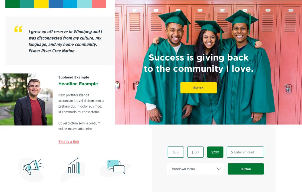
Solution
Present accurate information about the organization and its programs, taking users on a storytelling journey to aid in generating awareness of its mission and impact in society. Optimize the overall site structure to create a seamless user experience that increase lead generation and donation conversion rates.
Research
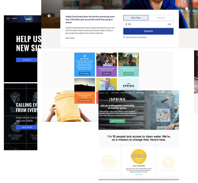
We started with a competitive analysis, to gather information on content hierarchy and the manner in which it's presented to the user as well as the flow a potential donor takes from landing on the site all the way to completing a donation form.
Key Learnings
Content
- Clear and concise communication on who the organization is and what they do
- Explain why the problem exists
- Outline how the organization addresses the problem
- Show donors how their contribution has created a positive impact
- Persistent donation button in the main navigation
Donation Flow
- Progressive disclosure
- Ability to quickly switch from a one time donation to monthly donations
- Base amount is pre-selected
- Amount denominations displayed is particular to each organization
- Statistics displayed to further encourage and provide evidence of what their contribution can do
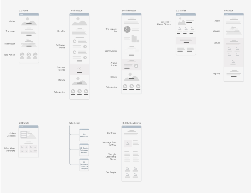
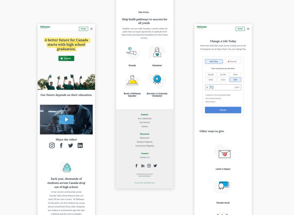
High level sitemap breakdown.
Sitemap
Once the Content Audit and Mapping was completed we set about creating a concise site map that would shift towards our goal of creating a strong narrative and communicate directly to our target audience.
We sought to create a flat navigation and distill the content into a digestible format, prioritizing key pages, and the ability to access the deepest nested pages within one or two clicks. This structure provided a clear path for the user to explore Pathways to Education while keeping things accessible and avoiding the use of too broad of a navigation.
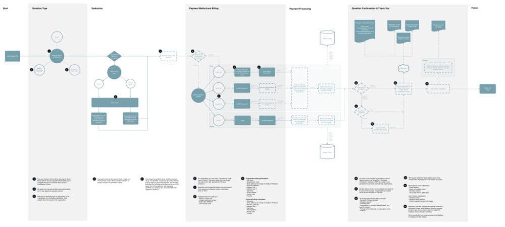
Donation task flow.
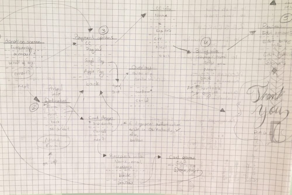
Donation UX
A workshop was conducted with key stakeholders to glean insights into their current donation flow, and their pain points. Requirements initially gathered were discussed and working together were able to create a high level path a donor would take. Through multiple iterations a clear flow was made from which to move forward with.
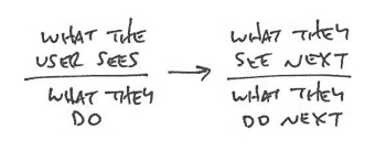
Shorthand UI example.
Shorthand UI
If you’ve read my past case studies, you’ll know that I’m a big fan of Basecamp’s use of Shorthand UI, where a really fast and efficient format is written about what needs to happen to illustrate user behaviour and the possible actions that can be taken all without resorting to any type of wireframing or design which can easily become outdated.
Donation shorthand UI
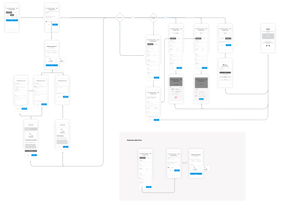
Donation wireflow.
Wireflow
After some iterations of the Shorthand UI, wireflows came into play, a hybrid of wireframes and user flows that best communicate internally and to stakeholders. Everyone can easily grasp the entire process and is better equipped to detect any missing pieces and possible pitfalls.
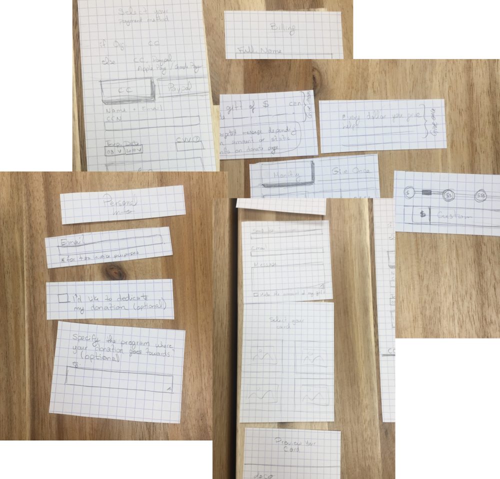
Wireframe sketches.
Select lo-fi wireframes.
Moodboard
Deciding on a new style to guide the new design, we looked to a report where online interviews were conducted to gain insights into people's association to Pathways emotional attributes and brand image. From this report we learned that Pathways scored highly in the Inspiring and Knowledgeable areas. Two styles were explored, each one touching on one of these emotional attributes.
We wanted to show a style that would be more of a gradual transition from what they previously had so that there would be familiarity and instant recognition with their current user base. With the other to push their brand personality a bit more, and further setting them apart from competitors.
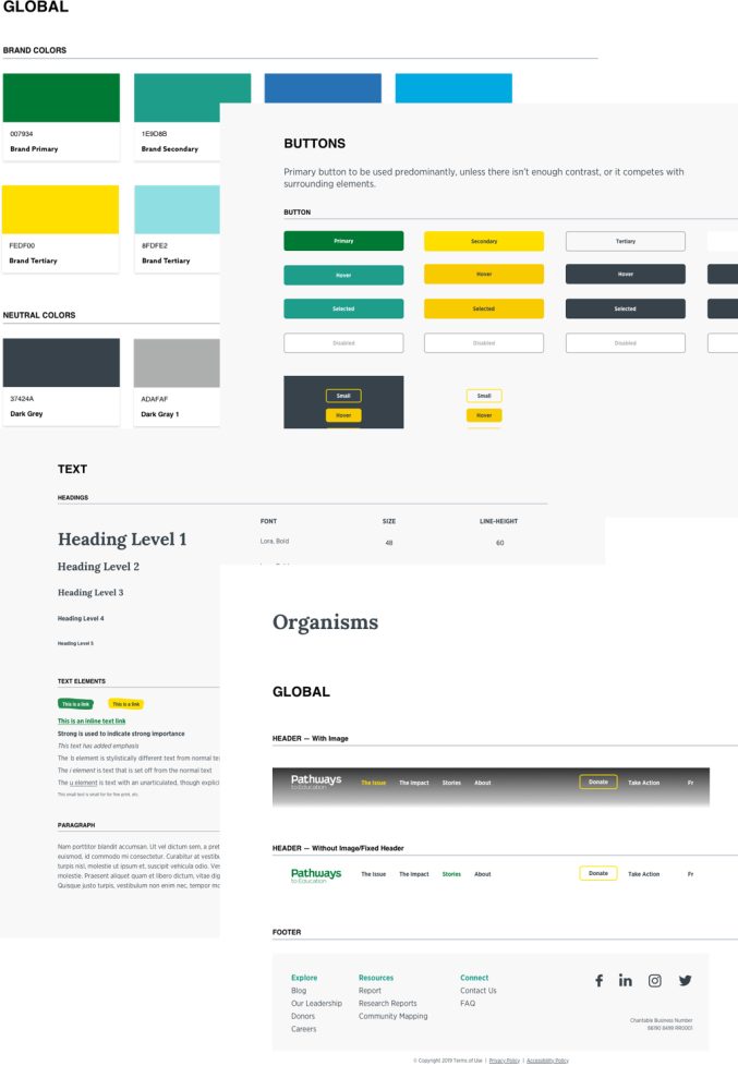
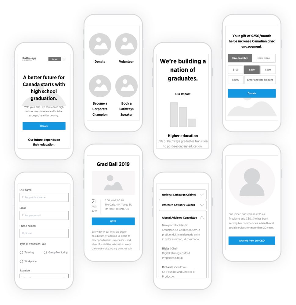
Component Design
A method we opted to implement for this project was Brad Frosts’ popular atomic design, a component based system that is broken down into atoms, molecules and organisms. With the moodboard paired with wireframes, we were able to dive directly into creating a set of components that encompassed everything from typography, image ratio, button states, etc.

Iconography
We handcrafted pixel perfect icons tailored to the new look and feel by focusing on 2 simple principles.
- Ensure they follow a thematic style and,
- Are consistent design elements.
Icon library
Continue Exploring
Masters of Scale Courses AppEducation
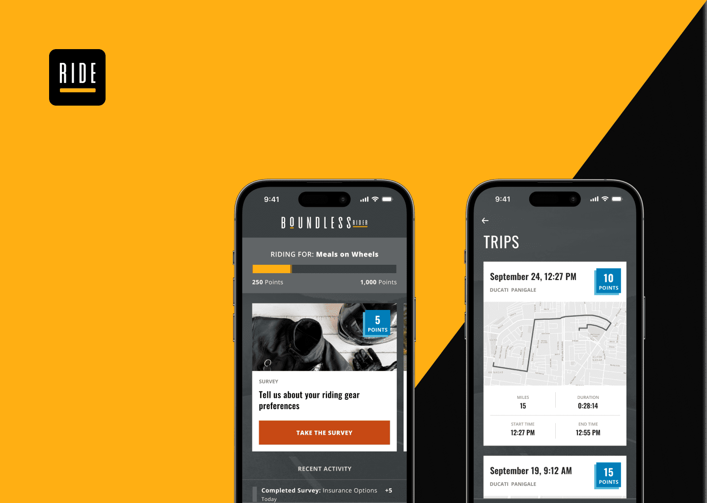
Boundless RiderInsurtech

CoFo DesigneCommerce
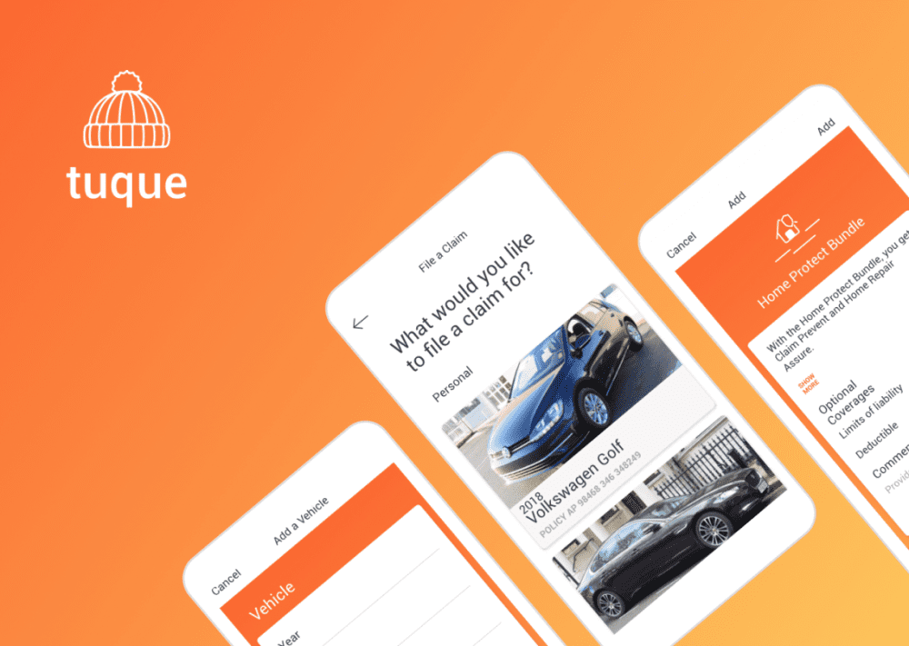
Tuque AppAuto Insurance
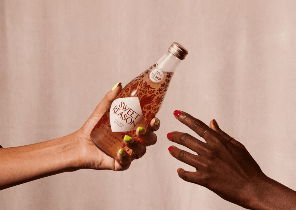
Sweet Reason - DrafteCommerce