eCommerce
Masters of Scale Courses App
Masters of Scale Courses App
Sweet Reason
Masters of Scale Courses App
Masters of Scale Courses App
ROLE
Lead UX/UI Designer
TEAM
Creative Director
Designer
Developer
Challenge
There is little emotional benefit communicated through the current buy-flow, and little messaging about why one travel insurance is different from its competitors. Current travel insurance purchase sites are transaction oriented, and are functionally undifferentiated from one another.
About
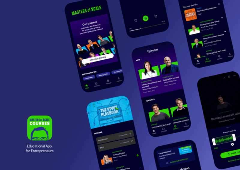
The Masters of Scale Courses app is a highly curated learning experience designed to cultivate the entrepreneurial mindset for leaders at any level, and at any stage in their company’s growth.
For its MVP, Masters of Scale sought to create and build a product for its podcast listeners that focused on a sophisticated learning experience. Offering premium content by distilling key insights centered around a 10 minute daily practice where entrepreneurs can then apply to their business.
About
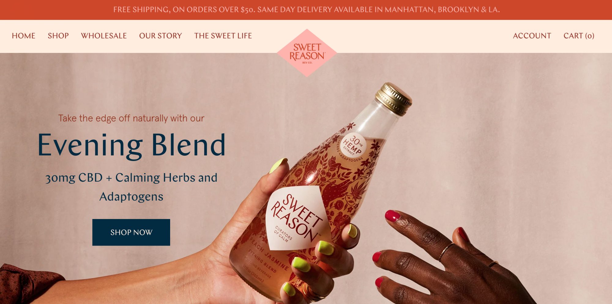
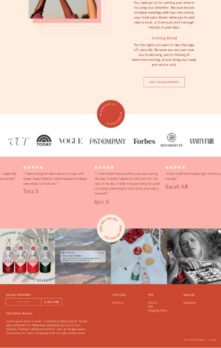
Sweet Reason is a beverage company specializing in hemp-derived, CBD-infused sparkling waters designed to promote relaxation and wellness. The brand offers products made with CO₂-extracted CBD from organic hemp, complemented by calming herbs and adaptogens like chamomile, lemon balm, and ashwagandha.
Update: Sweet Reason was acquired by Cann, a social tonic brand.
Challenge
Sweet Reason planned to launch a new beverage line. To support this, the brand sought a website redesign that would boost conversion rates and elevate their digital presence.
Challenge
There is little emotional benefit communicated through the current buy-flow, and little messaging about why one travel insurance is different from its competitors. Current travel insurance purchase sites are transaction oriented, and are functionally undifferentiated from one another.
About
The Masters of Scale Courses app is a highly curated learning experience designed to cultivate the entrepreneurial mindset for leaders at any level, and at any stage in their company’s growth.
For its MVP, Masters of Scale sought to create and build a product for its podcast listeners that focused on a sophisticated learning experience. Offering premium content by distilling key insights centered around a 10 minute daily practice where entrepreneurs can then apply to their business.
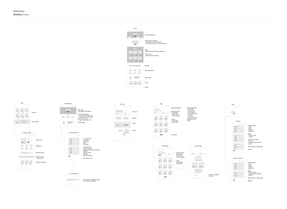
Wireflow
Solution
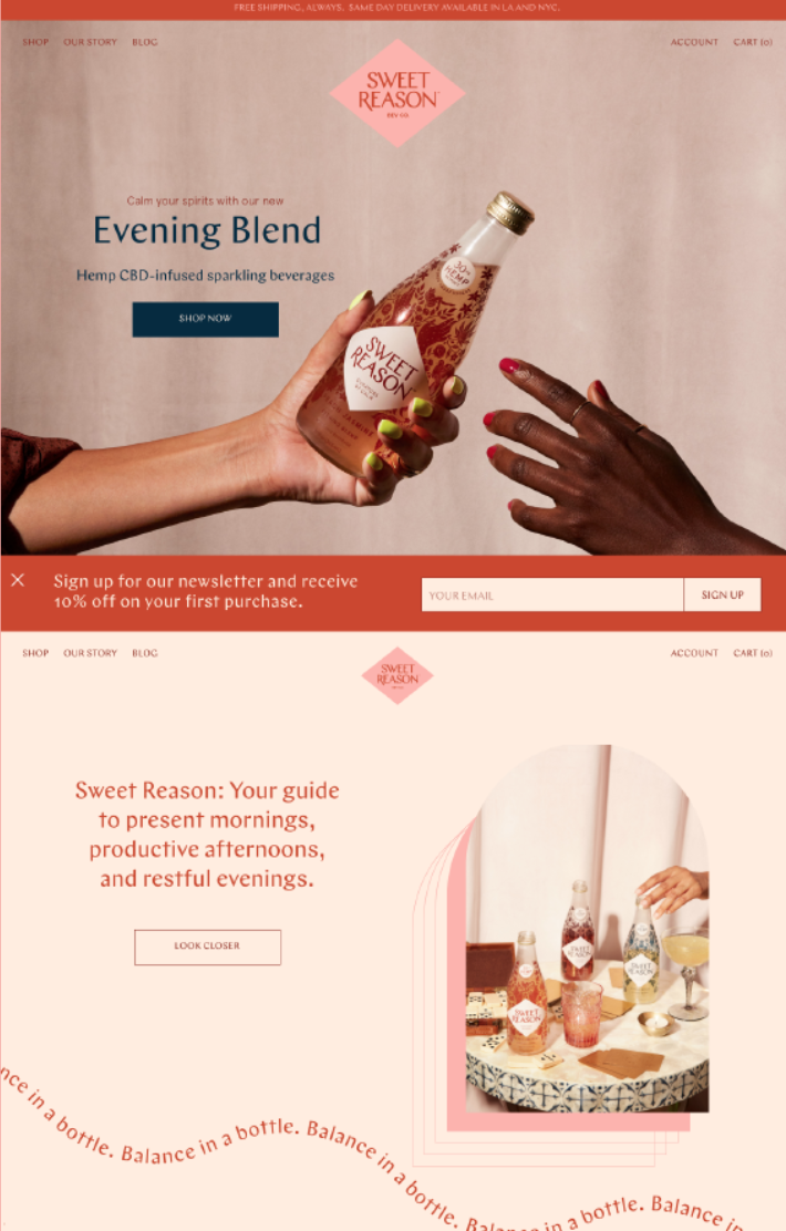
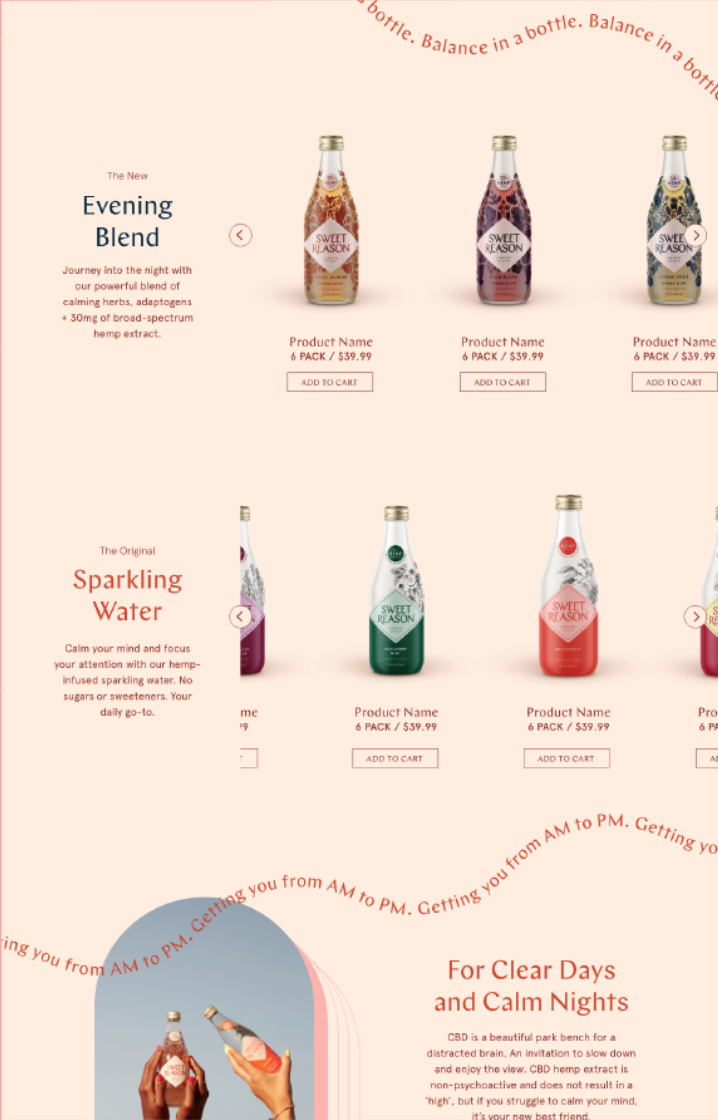
A full website redesign was implemented with a focus on user experience (UX) and brand storytelling.
Key Improvements
Homepage Revamp
Introduced bold visuals of the new beverage, integrated with calming lifestyle imagery to tell a cohesive brand story.
Product Pages
Enhanced with detailed ingredient breakdowns, wellness benefits, and reviews.
Mobile Optimization
Responsive design improvements led to a smoother checkout experience on mobile devices.
Subscriptions
Added features for curated bundles and auto-delivery, encouraging higher order values and retention.
Onboarding
First up was the rethinking around the onboarding flow. Not only did we have to include the option for users to enter the app without registering, but we also had data informing us that users were more likely to stick around and convert to paying members once they engaged with their first listening experience.
Results
Conversion Rates
+28% increase in overall conversion rates
Subscriptions
2.3x increase in subscriptions
New Beverage Launch
Accounted for 35% of all sales within the first quarter post-launch
Continue Exploring
Masters of Scale Courses AppEducation
Boundless RiderInsurtech
CoFo DesigneCommerce
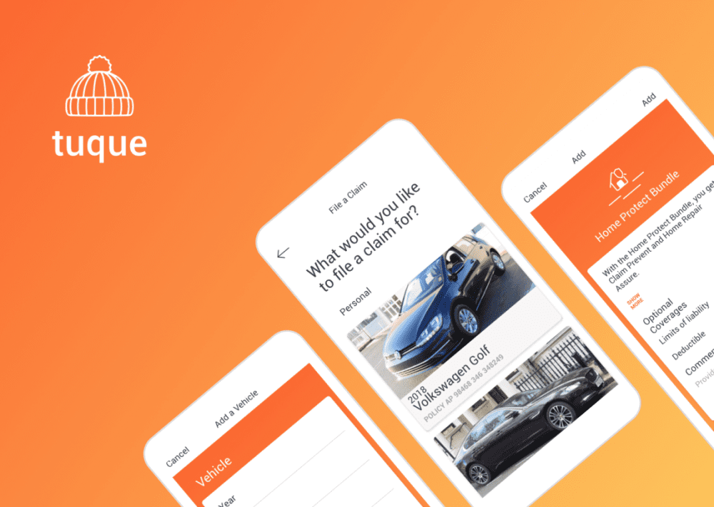
Tuque AppAuto Insurance
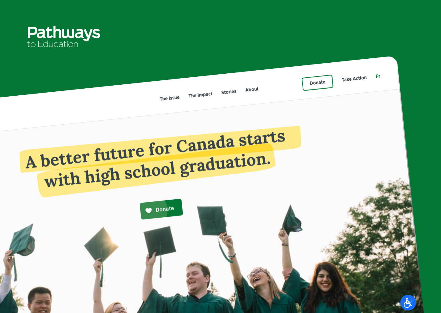
Pathways to EducationSocial Organization