Digital Catalogue
TIFF
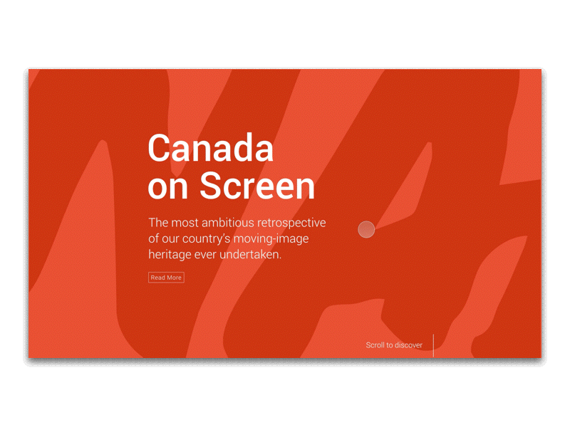
Canada on Screen
Toronto International Film Festival Inc. (TIFF) selectively chose 150 essential Canadian moving-image productions to launch an exclusive digital catalogue to showcase the Essential 150 pieces in an immersive and engaging online editorial experience.
Team
1 Art Director
1 Producer
1 UX + Interaction Designer
2 Developers
Team
1 Creative Director
1UX Designer
1 UI/UX Designer
Role
UX + Interaction Designer
Challenge
Create an experience that delights and encourages discovery, through an immersive and engaging experience.
Challenge
There is little emotional benefit communicated through the current buy-flow, and little messaging about why one travel insurance is different from its competitors. Current travel insurance purchase sites are transaction oriented, and are functionally undifferentiated from one another.
Solution
Working with the design provided by the TIFF team, we created a microsite that was rich in animation and interaction.
Solution
Design a new buy-flow interface that substantially differentiates it from other competitors by implementing a more humanistic purchasing experience, and a greater sense of personal customization and individualism.
UX Assessment
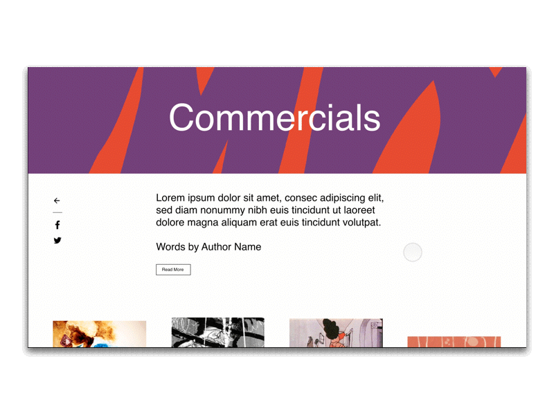
Before diving into interaction there was a pain point the TIFF design team shared with us and was looking to our expertise in UX to address it.
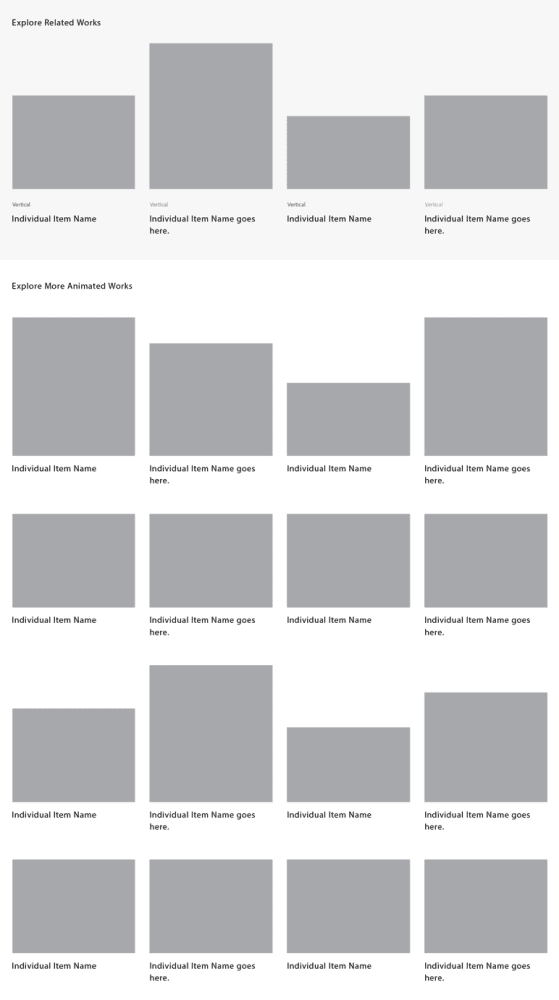
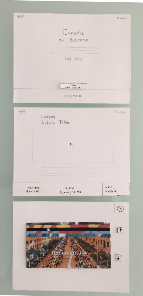
The problem we looked at was present within an Article page where the user, after consuming the content, would be looking to explore further articles. In the initial wires there were simply too many options available creating choice paralysis and breaking a very important UX principle.
The time it takes to make a decision increases with the number and complexity of choices.
— Hick’s Law
In order to address this we sought to look at two ways in which to help the user navigate articles as well as the categories.
- Reducing the number of choices.
This was achieved by displaying only 4 related articles, and we leveraged the taxonomy of each article by creating an algorithm that would display articles based on the values provided by the TIFF team. - Alternate navigation system.
Since there wasn’t a global navigation system throughout the microsite nor a desire to include one, we decided to implement one at the lower levels of the site. This allows the user to navigate through higher level content right within an article.
These two changes gives users two different and clear paths with which to continue their exploration of the catalogue.
The image here, shows the exploration we took in revamping the whole navigation system, but was ultimately condensed to only include the most pertinent pieces in displaying Prev/Next Articles, and View Categories.
Interaction Design
We sought ways to bring this site to life with animations, effects and add interactivity in places where they add value to the overall user experience.
When creating an animation language it’s important that I match it to the visual identity present. I do so by defining the mood, personality and tempo; creating a consistent and cohesive language that complements the site’s look and feel.
Mood
edgy, dynamic, surprising
Personality
hand-drawn, organic but not crafty, personal, fashion-inspired
Tempo
slow/medium
The following were the areas I looked at to enhance and add more value to the overall user experience.
Preloader
A good loading animation helps to manager user’s expectations and creates a delightful distraction from the loading time.
The first exploration was based off of the old Countdown Leader, which is used to ensure that the correct amount of time is allowed for the machine to run up to speed and arrive at the beginning of the movie.

The one we ended moving forward with was a simple screen fill so as not to overwhelm or take away from the bold and bright intro screen.
Scroll
An advantage of scrolling is the control it gives to the user, and for that, animation dictates the pace. It makes the user feel like they’re in control and simultaneously a part of the process.
We wanted the animation to match the intensity of the handwritten and bold typography.
Scroll
An advantage of scrolling is the control it gives to the user, and for that, animation dictates the pace. It makes the user feel like they’re in control and simultaneously a part of the process.
We wanted the animation to match the intensity of the handwritten and bold typography.
Scroll
An advantage of scrolling is the control it gives to the user, and for that, animation dictates the pace. It makes the user feel like they’re in control and simultaneously a part of the process.
We wanted the animation to match the intensity of the handwritten and bold typography.
Micro Interaction
This became an instructional guide to inform users on how to use the system. Since the human eye is attracted to motion, I knew a simple and smooth fade-in would draw the user’s attention to the toolbar without distracting from the content.
Micro Interaction
This became an instructional guide to inform users on how to use the system. Since the human eye is attracted to motion, I knew a simple and smooth fade-in would draw the user’s attention to the toolbar without distracting from the content.
Micro Interaction
This became an instructional guide to inform users on how to use the system. Since the human eye is attracted to motion, I knew a simple and smooth fade-in would draw the user’s attention to the toolbar without distracting from the content.
Continue Exploring
Masters of Scale Courses AppEducation
CoFo DesigneCommerce
Tuque AppAuto Insurance
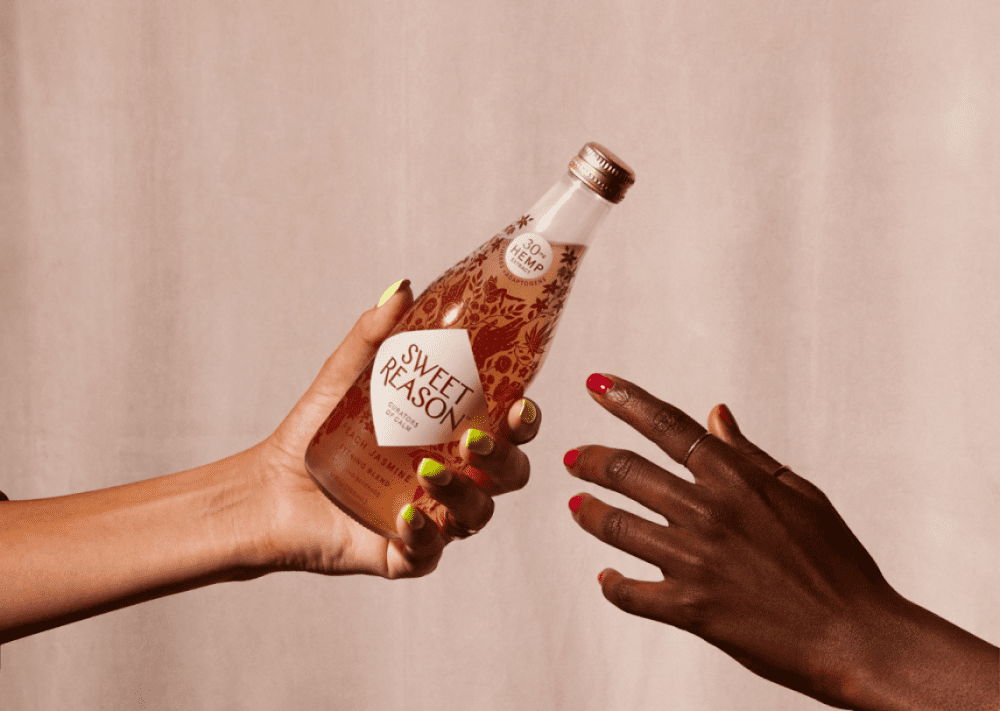
Sweet Reason - DrafteCommerce
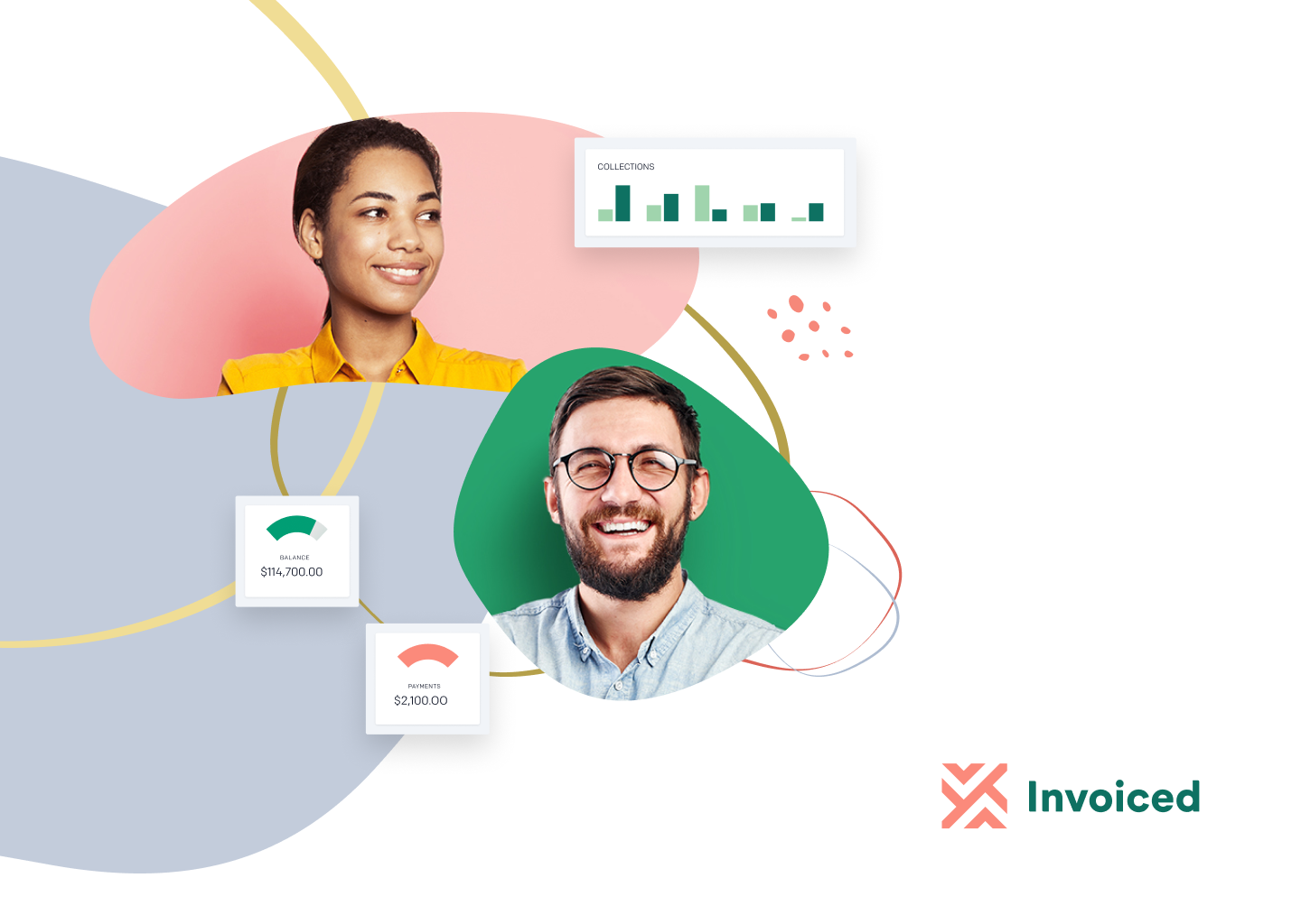
InvoicedFintech

Pathways to EducationSocial Organization